Size is the first real decision on a custom bookmark, and it quietly settles a dozen others. It sets how much of your design people actually see, whether the piece slips neatly into a paperback or sticks out the top of a hardback, how much you pay per unit, and how your file has to be built to print cleanly. Most bookmarks sold in North America land on one of about six sizes, and knowing what each one is good for saves you from guessing or, worse, redesigning after the proof comes back wrong.
The six sizes that cover almost every job
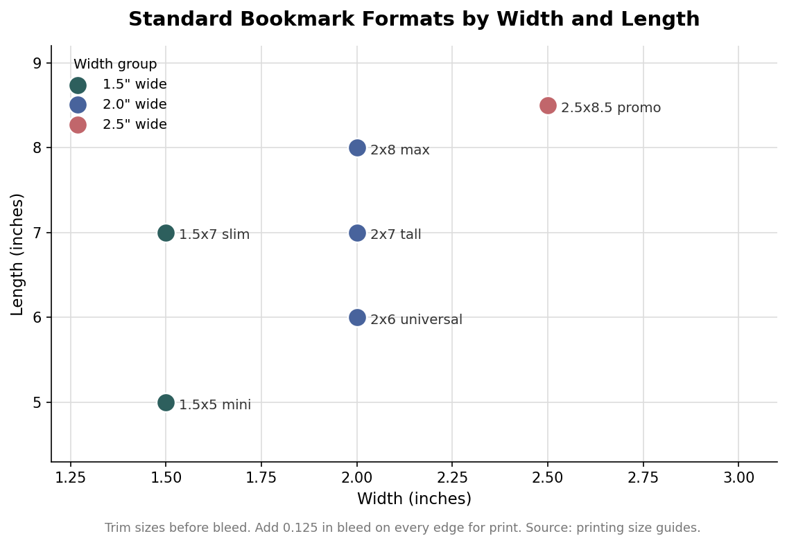
The 2 by 6 inch bookmark is the universal default. It fits most books, is stocked almost everywhere, and gives you enough room for a logo, a title and a short line of copy without feeling cramped. Step up to 2 by 7 when you want a taller canvas for a longer design or a pull quote, or 2 by 8 when you need maximum vertical space for a full illustration or a book-series list. On the narrower end, the 1.5 by 7 inch slim strip looks elegant and uses less paper, while the 1.5 by 5 inch mini suits kids’ books, mass-market paperbacks, or a lower-cost giveaway where you are printing in the thousands. The outlier is the 2.5 by 8.5 inch promo size, which is wide enough to carry a calendar, a coupon, a QR code or a reading list on the back. Those six formats handle the overwhelming majority of projects.
Why 2 by 6 is the safe default
When a size is not dictated by the design, 2 by 6 is the one to reach for. Because it is the most widely stocked format, it tends to be the cheapest to produce and the fastest to turn around, and it drops into everything from a trade paperback to a large hardback without poking awkwardly out of the top. It also photographs and displays well at retail, since it is the proportion most people recognize as a bookmark. Choose a different size when you have a specific reason, a tall illustration, a slim aesthetic, a back panel full of information, rather than defaulting to something unusual and paying for it in cost and shelf awkwardness.
When to size up or down
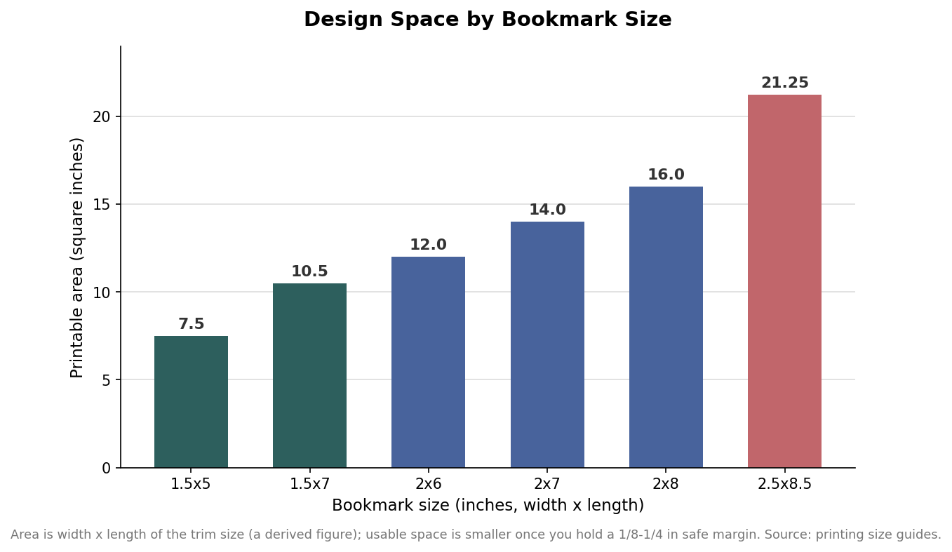
The practical difference between sizes is design space, and it grows faster than people expect. A 2 by 6 gives you 12 square inches of trim area; a 2 by 8 gives you 16, and the 2.5 by 8.5 promo format nearly doubles the mini at just over 21 square inches. That extra room is the whole reason to size up: a busy front with a detailed illustration, or a back panel meant to hold a coupon and a scannable code, needs it. Sizing down works in the opposite direction. A slim or mini bookmark reads as understated and cuts material cost per piece, which matters on a high-volume giveaway. Just remember that usable space is always smaller than the raw dimensions once you hold a margin, so do not plan a text-heavy back on a 1.5 by 5.
The print math: bleed, safe margin and resolution
A print-ready bookmark file is built slightly larger than the finished size. Add 0.125 inches of bleed on every edge, so any background color or image that runs to the edge extends past the trim line and there are no white slivers if the cut drifts a hair. Working inward, keep your important content, text, logos and anything you cannot afford to lose, at least an eighth to a quarter inch inside the trim as a safe margin. Build the artwork at 300 DPI at the finished size, because a bookmark is held in the hand and inspected up close, where low resolution shows immediately. These three numbers, bleed out, safe zone in, 300 DPI, are the difference between a file that prints cleanly the first time and one that bounces back from prepress.
Details that shift with the size
A few finishing choices depend on the format you picked. If the bookmark takes a tassel, the hole usually sits centered near the top, roughly a quarter to three-eighths of an inch down from the edge, with a clear ring of space around it so the punch does not clip your art; the hole itself is small, on the order of an eighth to a quarter inch across. Rounded corners, typically cut at about an eighth-inch radius, are worth adding because sharp corners are the first thing to fray and dog-ear in a bag or pocket. Stock matters more as the piece gets longer: thin paper on a 2 by 8 will curl and soften within a week, which is why heavier card, commonly in the 14 to 16 point range or above and often laminated in gloss, matte or soft-touch, is the norm. Finally, if you are printing both sides, remember that bookmarks flip on the long edge, so orient the back design accordingly or your reverse artwork will end up upside down.
Put together, the size guide is short: default to 2 by 6 unless the design gives you a reason not to, size up for illustration or a working back panel, size down for a slim look or a high-volume giveaway, and build every file with a 0.125 inch bleed, a comfortable safe margin and 300 DPI. Get the format right at the start and the rest of the spec, stock, corners, tassel, finishing, falls into place around it.